
*two-dimensional plots only, only works with enmtools.model objects, offer void in Nebraska
With a new function that I just uploaded last night, you can take any enmtools.model object and a set of environment layers, and you can visualize the response of your model to those two layers. Cool, huh? Check this out:
allogus.glm = enmtools.glm(pres ~ layer.1 + layer.2 + layer.3 + layer.4, allogus, env)
plot(allogus.glm)

env.plots = visualize.enm(allogus.glm, env, layers = c("layer.1", "layer.2"))
The first plot shows us the predicted suitability in environment space for two variables (layer.1 and layer.2), while holding the remaining variables constant at their mean value across all presence points. Here's that GLM:
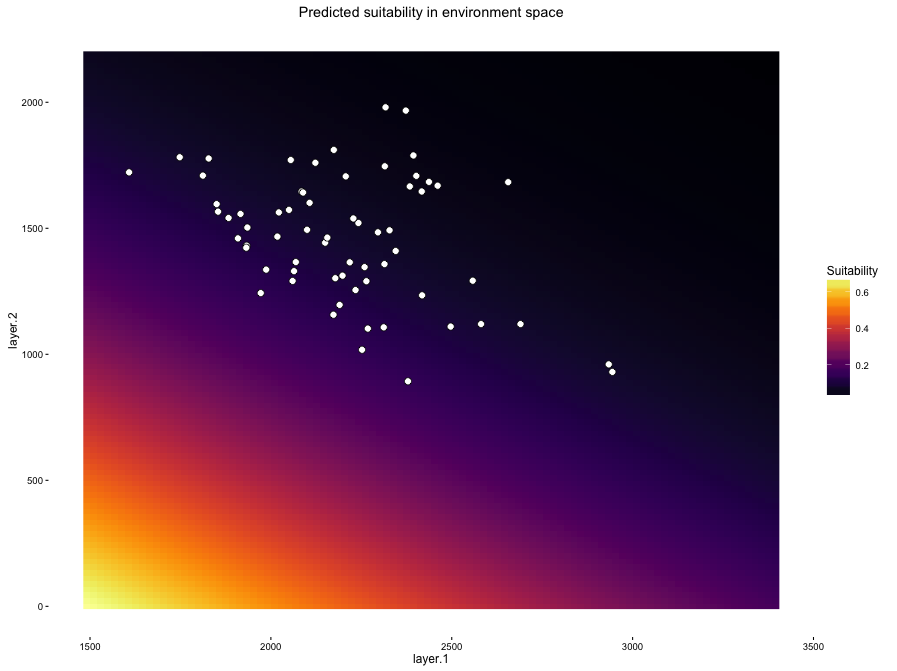
OH GOD THAT'S APPALLING. It does make sense given our geographic projection of the model, though - many occurrence points have low suitability scores. So what happened? The second plot gives us some insight.

The colored background here shows us the relative density of our background points in environment space. And this really points up one of the most significant conceptual things about ENMs that is worth having a good think about: presence/background methods are trying to estimate a function that distinguishes your occurrence points from your background points. Many of the occurrences for this species are very similar to the distribution of background data. As a result of this, these models tend to emphasize occurrences that happen in areas of environment space that are under-represented in the background. The model is essentially being "pulled" towards those points that occur in the black/purple areas of the background density plot, and as a result it tends to extrapolate heavily into areas of environment space in the bottom left. Where, it should be noted, we have no data of any sort. Yikes.
Cathy Newman asked via Twitter whether there were any of these plots that don't look funky, and the answer so far is "not many"! For Bioclim and Domain models you often get something that looks fairly reasonable, even though the geographic prediction may not be great. For example, here's a Domain model for another species:


Doesn't look as insane in environment space as that GLM up there, but as you can see the predicted habitat suitability is not a great reflection of the species' distribution. Which one of those models is more believable and/or useful is a very good question that I'm not going to delve into just now. I do think these plots are really useful and interesting for thinking about the modeling process, even though what they usually tell us is that our pretty maps are often associated with shockingly weird estimates of the underlying ecology.
All of the above is in the current version of ENMTools on GitHub. It does only work with enmtools.model objects, so you're going to need to walk through how to build those first. There's a nice readme on the GitHub landing page that should explain a lot.
Side note: the limits of the x and y axes are set by the max and min for each layer in the environmental layers you provide. If you want to zoom in, you can add xlim and ylim arguments after the fact. For instance, to zoom into the first environment space plot up at the top there, we could do:
env.plots$suit.plot + xlim(c(1500,3000)) + ylim(c(900, 2100))

FYI -- In visualize.enm: plot.points = FALSE only works for $suit.plot. The relevant code is missing from $background.plot to force the points to only appear when plot.points = TRUE.
ReplyDeleteOH thanks for pointing that out! Fixing it now!
ReplyDeleteThanks! Reinstalled & works now.
Delete