As of yesterday afternoon (Australia time), ENMTools can now do GAMs as well! That includes all of the hypothesis tests, visualization, etc. that you get with the other methods.
Just like the recent update to the enmtools.glm() function, enmtools.gam() has the ability to automatically build a function if you don't supply one. For instance if you have four layers in a stack called "env" named "layer.1", "layer.2", etc. and call enmtools.gam() thusly:
ahli.gam = enmtools.gam(ahli, env)
The function will automatically build the function:
presence ~ s(layer.1, k = 4) + s(layer.2, k = 4) + s(layer.3, k = 4) + s(layer.4, k = 4)
As you can see above, the default value for k, the smoothing parameter, is 4. This is not necessarily optimal, though, and it's definitely worth exploring for your specific data. You can either supply GAM formulas manually (using the "f" argument to enmtools.gam), or you can just provide a "k" argument, e.g,
ahli.gam = enmtools.gam(ahli, env, k = 6)
Which produces
presence ~ s(layer.1, k = 6) + s(layer.2, k = 6) + s(layer.3, k = 6) + s(layer.4, k = 6)
Formula arguments or k values can also be passed to the hypothesis testing functions (identity, background, rangebreak, etc.).

A general-purpose discussion zone for ecological biogeography.
Wednesday, August 3, 2016

Tuesday, August 2, 2016
Automatic formula building for enmtools.glm()
I just added a new bit of functionality to enmtools.glm. Nothing major, but it's kinda cool and it saves a bit of time when building GLMs that are strictly an additive function of a set of environment layers. It used to be that you'd have to pass enmtools.glm() a formula object in order to build a model, e.g.:
ahli.glm = enmtools.glm(f = pres ~ layer.1 + layer.2 + layer.3 + layer.4, species = ahli, env = env, test.prop = 0.2)
You CAN still do that, but now you no longer have to. Now if you don't pass it a formula, it assumes that your formula takes the form:
presence ~ layer.1 + layer.2 + ...
For every layer in your environment stack. That means you can just call it like the other enmtools modeling functions, e.g.,
ahli.glm = enmtools.glm(species = ahli, env = env, test.prop = 0.2)
And it will use all the layers in env. If you want a strictly additive formula that just uses a subset of those layers, you can just pass a subset of them to the env argument, like this:
ahli.glm = enmtools.glm(species = ahli, env = env[[c(1,3,5)]], test.prop = 0.2)
The function will then build a model using the formula
presence ~ env[[1]] + env[[3]] + env[[5]]
And ignore all the other layers.
If you want some sort of more complicated functional response (polynomials, interactions, etc.), you'll still need to supply the formula manually.
ahli.glm = enmtools.glm(f = pres ~ layer.1 + layer.2 + layer.3 + layer.4, species = ahli, env = env, test.prop = 0.2)
You CAN still do that, but now you no longer have to. Now if you don't pass it a formula, it assumes that your formula takes the form:
presence ~ layer.1 + layer.2 + ...
For every layer in your environment stack. That means you can just call it like the other enmtools modeling functions, e.g.,
ahli.glm = enmtools.glm(species = ahli, env = env, test.prop = 0.2)
And it will use all the layers in env. If you want a strictly additive formula that just uses a subset of those layers, you can just pass a subset of them to the env argument, like this:
ahli.glm = enmtools.glm(species = ahli, env = env[[c(1,3,5)]], test.prop = 0.2)
The function will then build a model using the formula
presence ~ env[[1]] + env[[3]] + env[[5]]
And ignore all the other layers.
If you want some sort of more complicated functional response (polynomials, interactions, etc.), you'll still need to supply the formula manually.
Monday, August 1, 2016
Visualizing ENMs in environment space
Hey, wouldn't it be nice if you could look at the predictions your ENM makes in environment space? Well now you can!*
*two-dimensional plots only, only works with enmtools.model objects, offer void in Nebraska
With a new function that I just uploaded last night, you can take any enmtools.model object and a set of environment layers, and you can visualize the response of your model to those two layers. Cool, huh? Check this out:
allogus.glm = enmtools.glm(pres ~ layer.1 + layer.2 + layer.3 + layer.4, allogus, env)
plot(allogus.glm)

env.plots = visualize.enm(allogus.glm, env, layers = c("layer.1", "layer.2"))
env.plots
The first plot shows us the predicted suitability in environment space for two variables (layer.1 and layer.2), while holding the remaining variables constant at their mean value across all presence points. Here's that GLM:

OH GOD THAT'S APPALLING. It does make sense given our geographic projection of the model, though - many occurrence points have low suitability scores. So what happened? The second plot gives us some insight.

The colored background here shows us the relative density of our background points in environment space. And this really points up one of the most significant conceptual things about ENMs that is worth having a good think about: presence/background methods are trying to estimate a function that distinguishes your occurrence points from your background points. Many of the occurrences for this species are very similar to the distribution of background data. As a result of this, these models tend to emphasize occurrences that happen in areas of environment space that are under-represented in the background. The model is essentially being "pulled" towards those points that occur in the black/purple areas of the background density plot, and as a result it tends to extrapolate heavily into areas of environment space in the bottom left. Where, it should be noted, we have no data of any sort. Yikes.
Cathy Newman asked via Twitter whether there were any of these plots that don't look funky, and the answer so far is "not many"! For Bioclim and Domain models you often get something that looks fairly reasonable, even though the geographic prediction may not be great. For example, here's a Domain model for another species:


Doesn't look as insane in environment space as that GLM up there, but as you can see the predicted habitat suitability is not a great reflection of the species' distribution. Which one of those models is more believable and/or useful is a very good question that I'm not going to delve into just now. I do think these plots are really useful and interesting for thinking about the modeling process, even though what they usually tell us is that our pretty maps are often associated with shockingly weird estimates of the underlying ecology.
All of the above is in the current version of ENMTools on GitHub. It does only work with enmtools.model objects, so you're going to need to walk through how to build those first. There's a nice readme on the GitHub landing page that should explain a lot.
Side note: the limits of the x and y axes are set by the max and min for each layer in the environmental layers you provide. If you want to zoom in, you can add xlim and ylim arguments after the fact. For instance, to zoom into the first environment space plot up at the top there, we could do:
env.plots$suit.plot + xlim(c(1500,3000)) + ylim(c(900, 2100))

*two-dimensional plots only, only works with enmtools.model objects, offer void in Nebraska
With a new function that I just uploaded last night, you can take any enmtools.model object and a set of environment layers, and you can visualize the response of your model to those two layers. Cool, huh? Check this out:
allogus.glm = enmtools.glm(pres ~ layer.1 + layer.2 + layer.3 + layer.4, allogus, env)
plot(allogus.glm)

env.plots = visualize.enm(allogus.glm, env, layers = c("layer.1", "layer.2"))
The first plot shows us the predicted suitability in environment space for two variables (layer.1 and layer.2), while holding the remaining variables constant at their mean value across all presence points. Here's that GLM:
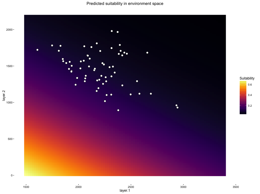
OH GOD THAT'S APPALLING. It does make sense given our geographic projection of the model, though - many occurrence points have low suitability scores. So what happened? The second plot gives us some insight.

The colored background here shows us the relative density of our background points in environment space. And this really points up one of the most significant conceptual things about ENMs that is worth having a good think about: presence/background methods are trying to estimate a function that distinguishes your occurrence points from your background points. Many of the occurrences for this species are very similar to the distribution of background data. As a result of this, these models tend to emphasize occurrences that happen in areas of environment space that are under-represented in the background. The model is essentially being "pulled" towards those points that occur in the black/purple areas of the background density plot, and as a result it tends to extrapolate heavily into areas of environment space in the bottom left. Where, it should be noted, we have no data of any sort. Yikes.
Cathy Newman asked via Twitter whether there were any of these plots that don't look funky, and the answer so far is "not many"! For Bioclim and Domain models you often get something that looks fairly reasonable, even though the geographic prediction may not be great. For example, here's a Domain model for another species:


Doesn't look as insane in environment space as that GLM up there, but as you can see the predicted habitat suitability is not a great reflection of the species' distribution. Which one of those models is more believable and/or useful is a very good question that I'm not going to delve into just now. I do think these plots are really useful and interesting for thinking about the modeling process, even though what they usually tell us is that our pretty maps are often associated with shockingly weird estimates of the underlying ecology.
All of the above is in the current version of ENMTools on GitHub. It does only work with enmtools.model objects, so you're going to need to walk through how to build those first. There's a nice readme on the GitHub landing page that should explain a lot.
Side note: the limits of the x and y axes are set by the max and min for each layer in the environmental layers you provide. If you want to zoom in, you can add xlim and ylim arguments after the fact. For instance, to zoom into the first environment space plot up at the top there, we could do:
env.plots$suit.plot + xlim(c(1500,3000)) + ylim(c(900, 2100))

R users: update your R!
Hey y'all, if you're doing a bunch of SDM/ENM stuff in R and are finding that many of your operations are running really slowly, you should check your R version. R version 3.3.0 has some sort of bug going on that causes it to handle many raster operations VERY slowly, including extracting data from a raster using points.
It's a very odd bug, because it causes the operation to get slower and slower the more points you add (which makes sense), but then suddenly gets considerably faster when you're using over 250 points. So extracting data using 250 points might take three minutes, while 251 points takes three seconds. Crazy, but at least the fix is easy!
It's a very odd bug, because it causes the operation to get slower and slower the more points you add (which makes sense), but then suddenly gets considerably faster when you're using over 250 points. So extracting data using 250 points might take three minutes, while 251 points takes three seconds. Crazy, but at least the fix is easy!
Sunday, July 31, 2016
Hey, what's up with those environmental overlaps in the ENMTools R package?
I'm so glad I asked! The env.overlap metrics produced by the ENMTools R package are based on methods developed by John Baumgartner and myself. The purpose of these metrics is to address one of the key issues with the niche overlap metrics currently implemented in ENMTools and elsewhere; the difference between the geographic distribution of suitability and the distribution of suitability in environment space.
Existing methods in ENMTools and most other packages measure similarity between models via some metric that quantifies the similarity in predicted suitability of habitat in geographic space. While this may be exactly the sort of thing you'd like to measure if you're wondering about the potential for species to occupy the same habitat in an existing landscape, it can be somewhat misleading if the availability of habitat types on the landscape is strongly biased. For instance, what if two species have very little niche overlap in environment space, but that overlap happens to occur in a combination of environments that turns out to be very common in the current landscape?
To illustrate, let's take two species (red and blue) and look at their niches in environment space:

So they're pretty different, right? But what if the only available environments in the study region occur in that area of overlap? E.g., what if the current environment space is represented by the green area here?

Well then the only environments we have within which we can measure similarity between species happen to be those environments that are suitable for both! This means that our measure of overlap between models in geographic space could be arbitrarily disconnected from the actual similarity between those models in environment space. Depending on the sort of question we're trying to ask, that could be quite misleading.
The method of measuring overlap developed by Broennimann et al. (2012) deals with this issue to some extent. However, those methods only work in two dimensions, and only work by using a kernel density approach based on occurrence points in environment space. My guess is that that's still way better than what the original ENMTools approach did for most purposes, but it's not very useful if (for instance) you want to ask how similar the environmental predictions of a GLM are to, say, an RF model. You simply can't do it. Or if you want to ask questions in a higher dimensional space, you're basically out of luck.
So what can we do? Can we figure out a way to measure overlap between two arbitrary models in a n-dimensional space? It turns out that this is not easy to do exactly, but you can get approximate measures to an arbitrary level of precision fairly easily!
Our approach leverages the fact that R already has great packages for doing Latin hypercube sampling. This allows us to draw random, but largely independent, points from that n-dimensional environment space. We can then use dismo's predict function to project our models to those points in environment space, and measure suitability differences between species. Obviously throwing just a couple of points into a 19-dimensional space (for instance, if you're using all Bioclim variables) isn't going to get you very close to the truth, but of course if you keep throwing more points in there you will get closer and closer to the true average similarity between models across the space.
SO that's what the method does: it starts by making a random Latin hypercube sample of 10,000 points from the space of all combinations of environments, with each variable bound by it's maximum and minimum in the current environment space. Then it chucks another 10,000 points in there, and it asks how different the answer with 20,000 points is compared to the answer with 10,000. Then repeat for 30,000 vs. 20,000, and so on, until subsequent measures fall below some threshold tolerance level. This allows us to get arbitrarily close to the true overlap by specifying our tolerance level. Lower tolerances take longer and longer to process, since it requires more samples for the value to converge. However, we've found that with tolerances set at around .001 we get very consistent results for a 4-dimensional comparison with an execution time of around two seconds.
Pretty cool, huh? Now you can compare the environmental predictions of any two models that can be projected using ENMTools' predict() function in environment space, instead of just looking at their projections into a given geographic space!
Existing methods in ENMTools and most other packages measure similarity between models via some metric that quantifies the similarity in predicted suitability of habitat in geographic space. While this may be exactly the sort of thing you'd like to measure if you're wondering about the potential for species to occupy the same habitat in an existing landscape, it can be somewhat misleading if the availability of habitat types on the landscape is strongly biased. For instance, what if two species have very little niche overlap in environment space, but that overlap happens to occur in a combination of environments that turns out to be very common in the current landscape?
To illustrate, let's take two species (red and blue) and look at their niches in environment space:

So they're pretty different, right? But what if the only available environments in the study region occur in that area of overlap? E.g., what if the current environment space is represented by the green area here?

Well then the only environments we have within which we can measure similarity between species happen to be those environments that are suitable for both! This means that our measure of overlap between models in geographic space could be arbitrarily disconnected from the actual similarity between those models in environment space. Depending on the sort of question we're trying to ask, that could be quite misleading.
The method of measuring overlap developed by Broennimann et al. (2012) deals with this issue to some extent. However, those methods only work in two dimensions, and only work by using a kernel density approach based on occurrence points in environment space. My guess is that that's still way better than what the original ENMTools approach did for most purposes, but it's not very useful if (for instance) you want to ask how similar the environmental predictions of a GLM are to, say, an RF model. You simply can't do it. Or if you want to ask questions in a higher dimensional space, you're basically out of luck.
So what can we do? Can we figure out a way to measure overlap between two arbitrary models in a n-dimensional space? It turns out that this is not easy to do exactly, but you can get approximate measures to an arbitrary level of precision fairly easily!
Our approach leverages the fact that R already has great packages for doing Latin hypercube sampling. This allows us to draw random, but largely independent, points from that n-dimensional environment space. We can then use dismo's predict function to project our models to those points in environment space, and measure suitability differences between species. Obviously throwing just a couple of points into a 19-dimensional space (for instance, if you're using all Bioclim variables) isn't going to get you very close to the truth, but of course if you keep throwing more points in there you will get closer and closer to the true average similarity between models across the space.
SO that's what the method does: it starts by making a random Latin hypercube sample of 10,000 points from the space of all combinations of environments, with each variable bound by it's maximum and minimum in the current environment space. Then it chucks another 10,000 points in there, and it asks how different the answer with 20,000 points is compared to the answer with 10,000. Then repeat for 30,000 vs. 20,000, and so on, until subsequent measures fall below some threshold tolerance level. This allows us to get arbitrarily close to the true overlap by specifying our tolerance level. Lower tolerances take longer and longer to process, since it requires more samples for the value to converge. However, we've found that with tolerances set at around .001 we get very consistent results for a 4-dimensional comparison with an execution time of around two seconds.
Pretty cool, huh? Now you can compare the environmental predictions of any two models that can be projected using ENMTools' predict() function in environment space, instead of just looking at their projections into a given geographic space!
Friday, July 29, 2016
All rangebreak tests now available in ENMTools R package
As of yesterday, all rangebreak tests are now available in the R package. There are still some rough edges to be smoothed off and all that, but if you are doing a rangebreak-y study and need that sort of thing, it is usable. Demo code and example outputs are now available on the readme at:
https://github.com/danlwarren/ENMTools
https://github.com/danlwarren/ENMTools
ENMTools R package model plots are now all done in ggplot2
Newest update (I did say they'd be coming very rapidly now, didn't I?): I've switched the enmtools model plots from using base raster plotting functions to using ggplot2. They don't actually look very different, as you can see by comparing base (top) to ggplot2 (bottom) plots:


However the switch to ggplot2 allows for a lot more flexibility down the line, and also makes it easier to store plots as objects for future manipulation.
Subscribe to:
Posts (Atom)